Turning Chance into Conversion:
The VriendenLoterij E-bike Campaign
The VriendenLoterij E-bike Campaign
Overview
In just 8 weeks, we transformed a lottery campaign into a high-converting digital experience that increased user engagement by 28% and reduced form abandonment by 35%.
Summary
In a world dominated by smartphones, we embarked on a mobile-first redesign of the VriendenLoterij website to boost user engagement and drive conversions. By focusing on a streamlined user experience, intuitive navigation, and visually appealing design, we achieved significant improvements in key metrics.
Key Metrics:
1.
28% Increase in Campaign Participation
2.
12.8% Lift in Conversion Rate via A/B Testing
3.
35% Reduction in Form Abandonment
Three Critical Design Decisions
Traditional lottery campaigns suffer from:
- Low engagement rates
- Complex participation processes
- User excitement is dropping
The Solution:
1.
“Eye on the Prize” Design Strategy
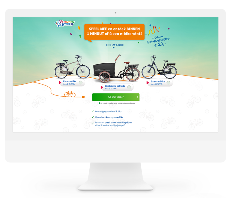
We restructured the landing page to immediately showcase the E-bike, creating an instant emotional connection. Users could:
- Visualize their potential win
- Select their preferred bike model
- Understand the prize instantly
2.
Urgency-Driven Conversion Optimization
Implemented a dynamic A/B testing approach:
- Added blinking indicator near CTAs
- Incorporated time-sensitive messaging
- Result: 12.8% conversion rate improvement
3.
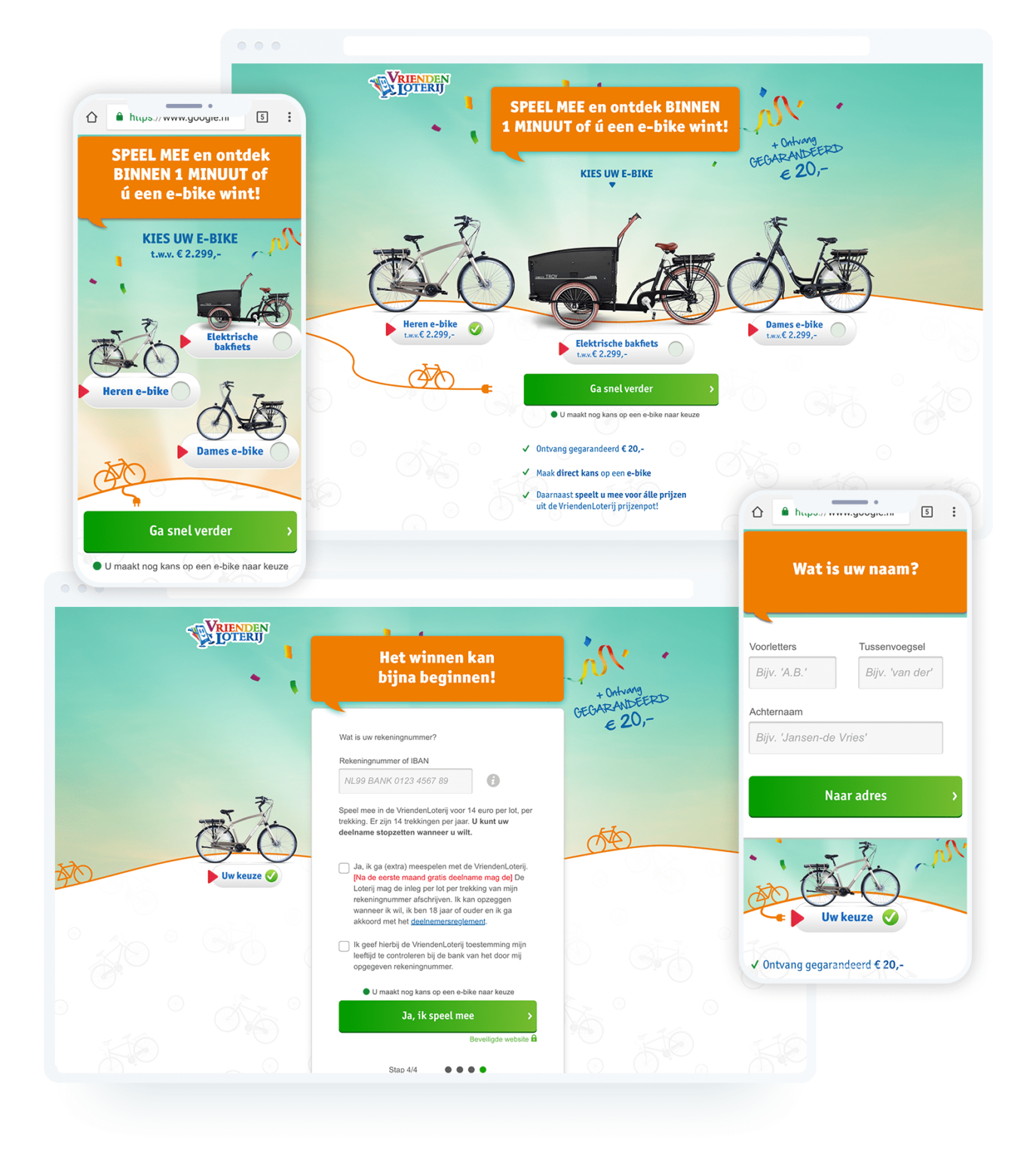
Efficient Engagement Workflow
Simplified the registration process:
- Enhanced form fields
- Implemented progressive disclosure
- Offered instant €20 reward for signup
Behind the Design: Nuanced Insights
1.
Stakeholder Collaboration
Worked closely with:
- Marketing team to align campaign goals
- Frontend developers for technical feasibility
- Senior management for strategic alignment
2.
Technical Design Considerations
- Responsive design across devices
- Accessibility compliance
- Performance optimization
3.
Continuous Improvement Methodology
- Run multiple A/B tests
- Gather real-time user & data feedback
- Iteratively refining design elements
Learning & Reflections
1.
What Worked Brilliantly
- “Eye on the Prize” visual strategy
- Urgency-driven design elements
- Instant gratification with €20 reward
2.
Challenges Encountered
- Balancing visual excitement with information clarity
- Maintaining design consistency across multiple platforms
3.
Key Takeaways
- Emotional connection trumps complex explanations
- Small design tweaks can significantly impact conversion
- Continuous testing is not optional—it’s essential
CRO/UX
We continuously optimize conversions through A/B testing on every project. As part of the CRO team, I planned and designed A/B tests for upcoming campaigns.
These are some examples I can give you:
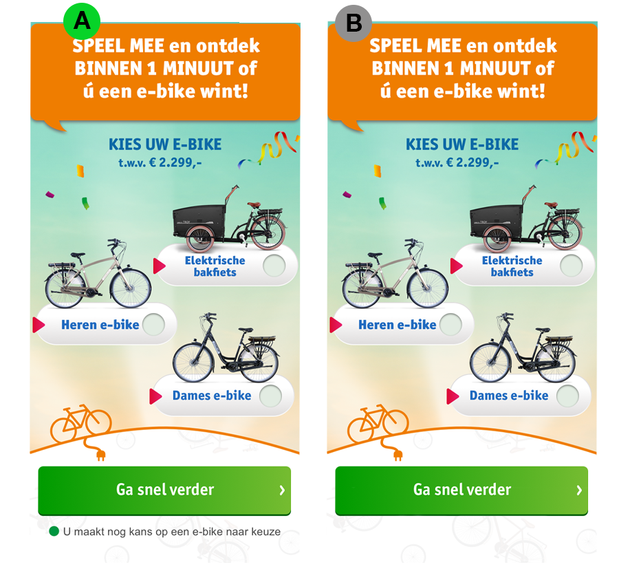
A/B Test Example
Hypothesis
By adding urgency that bicycles can still be won with a flashing dot and text under the CTA, people are more likely to participate.
Results
Version A performed significantly better than version B. Version A has +12.8% CR.
Advice
This test will be continued in new campagnes.
DELIVERABLES
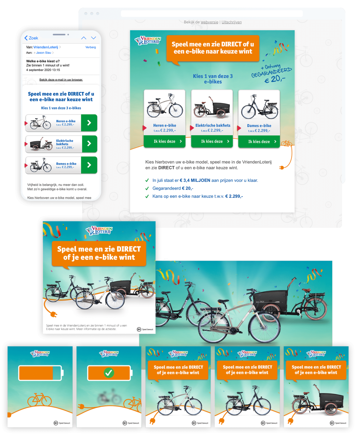
For a big campaign like this, many banners are produced. Always in many variants and with a lot of testing.